Back
Case studies should be viewed in bigger screens for now
Back
Case studies should be viewed in bigger screens for now
Back
Case studies should be viewed in bigger screens for now
Back
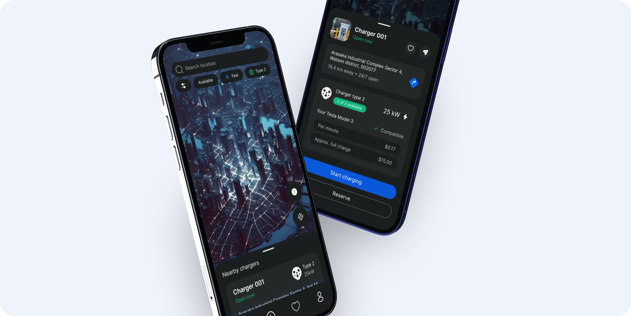
TBC Bank: Solving physical problems with digital solutions
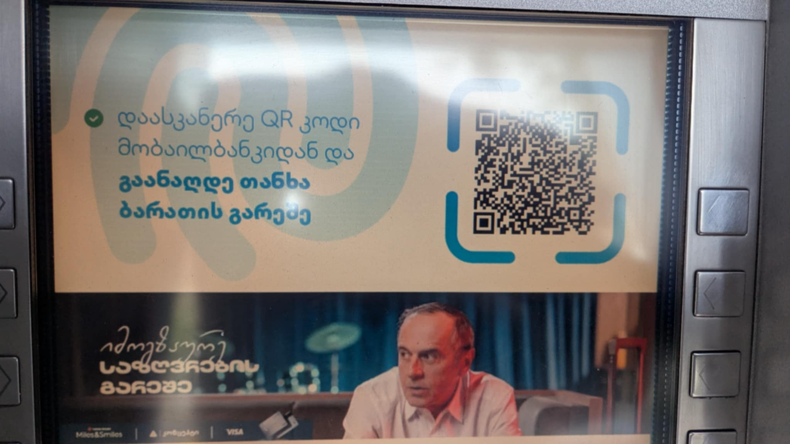
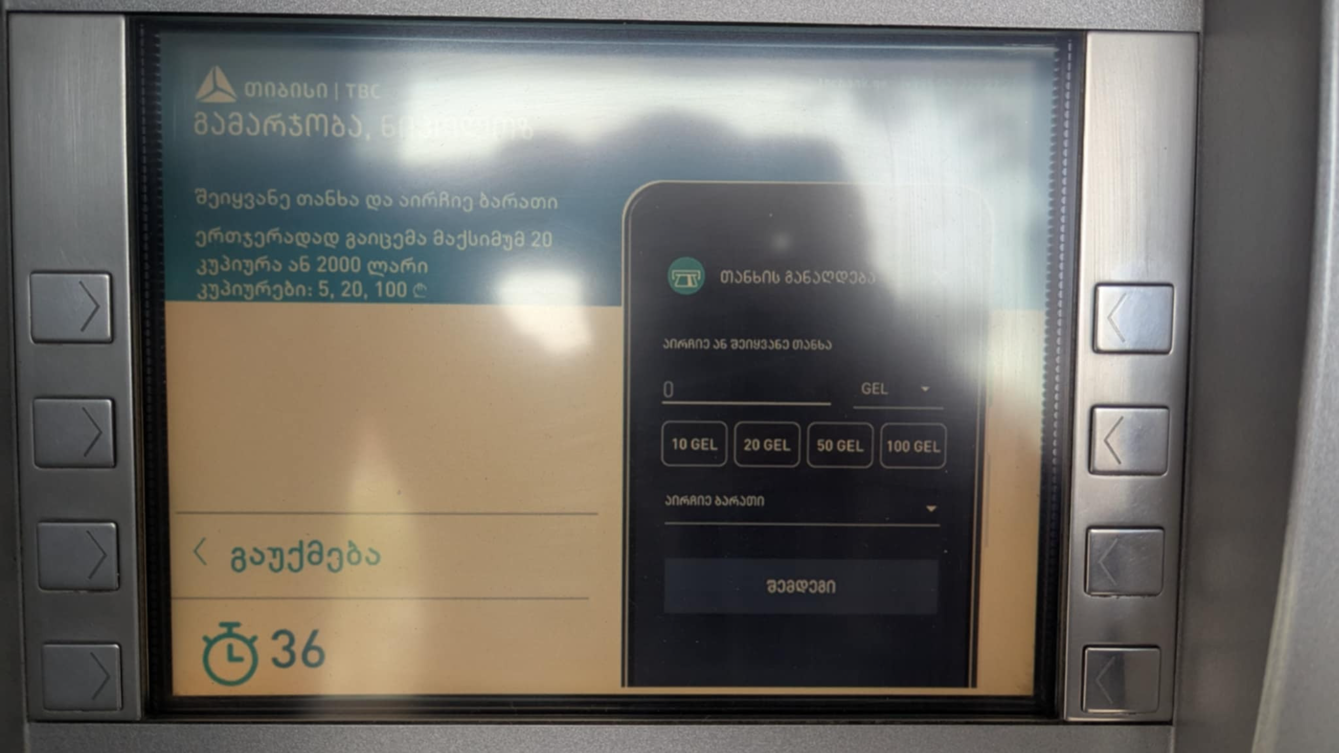
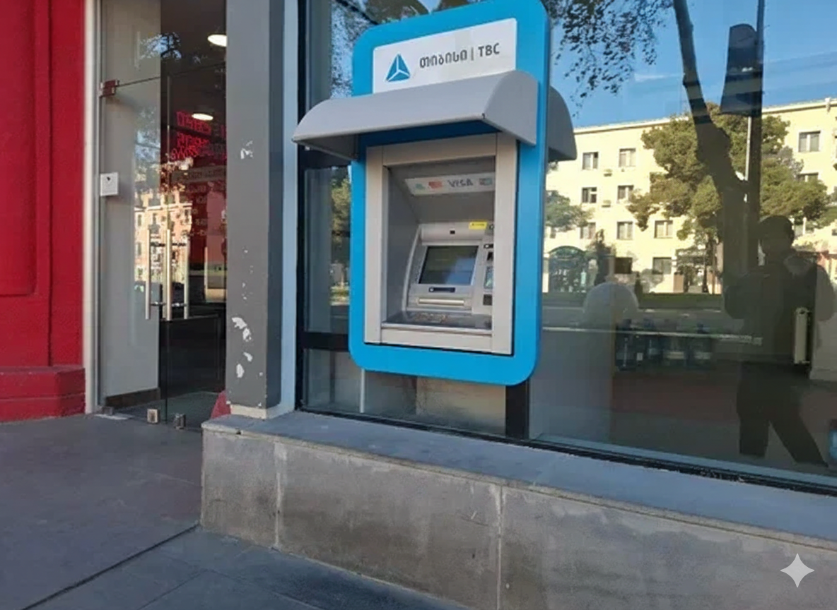
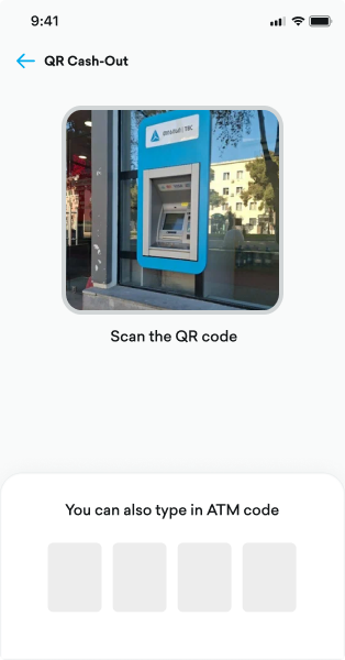
TBC Bank’s - QR Cash-Out. it’s a Mobile app feature that lets users withdraw cash from ATMs using only their phone, scanning a QR code instead of inserting a physical card.
App name
TBC
My role
Product designer
Platform
iOS / Android
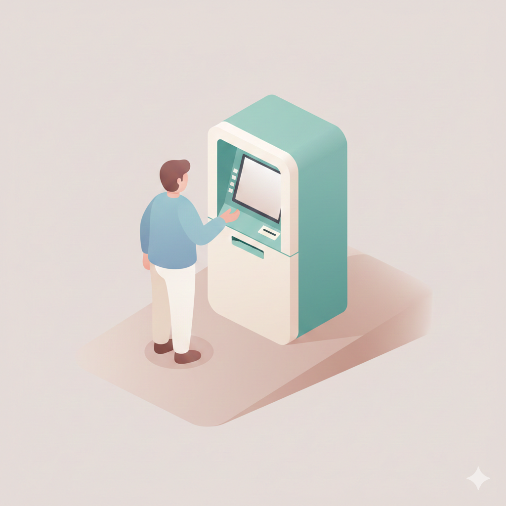
TBC’s QR Cash-Out was already live, enabling users to withdraw cash without a physical card. Yet adoption remained low—most users weren’t aware of the feature, and those who did often encountered real/digital-world friction.
My challenge was to understand why a feature designed for convenience wasn’t performing as expected, identify the barriers across both the physical and digital touchpoints, and redesign the experience to make cash-out more intuitive, visible, and usable in real conditions.
During discovery, initial UX audit revealed critical usability issues, particularly around feature visibility and user flows. However, to improve adoption and uncover deeper behavioral problems, we conducted both qualitative and quantitative research.


These findings helped us reframe QR Cash-Out not just as a digital ATM replacement, but as a real-world experience shaped by environment, context, and user habits.
Marketing Message Placeholder
Scan QR code from the App and cash-out without a card
or type
4
6
2
3

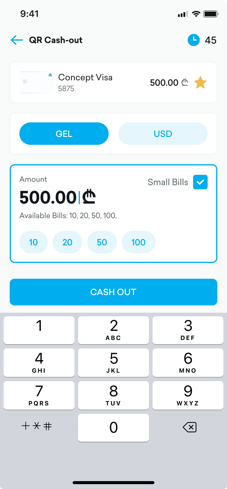
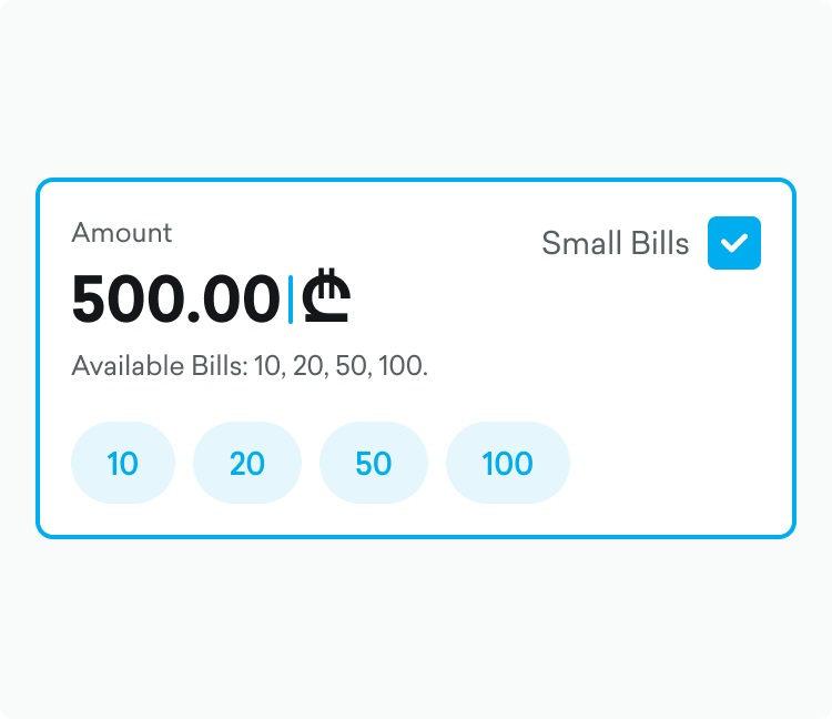
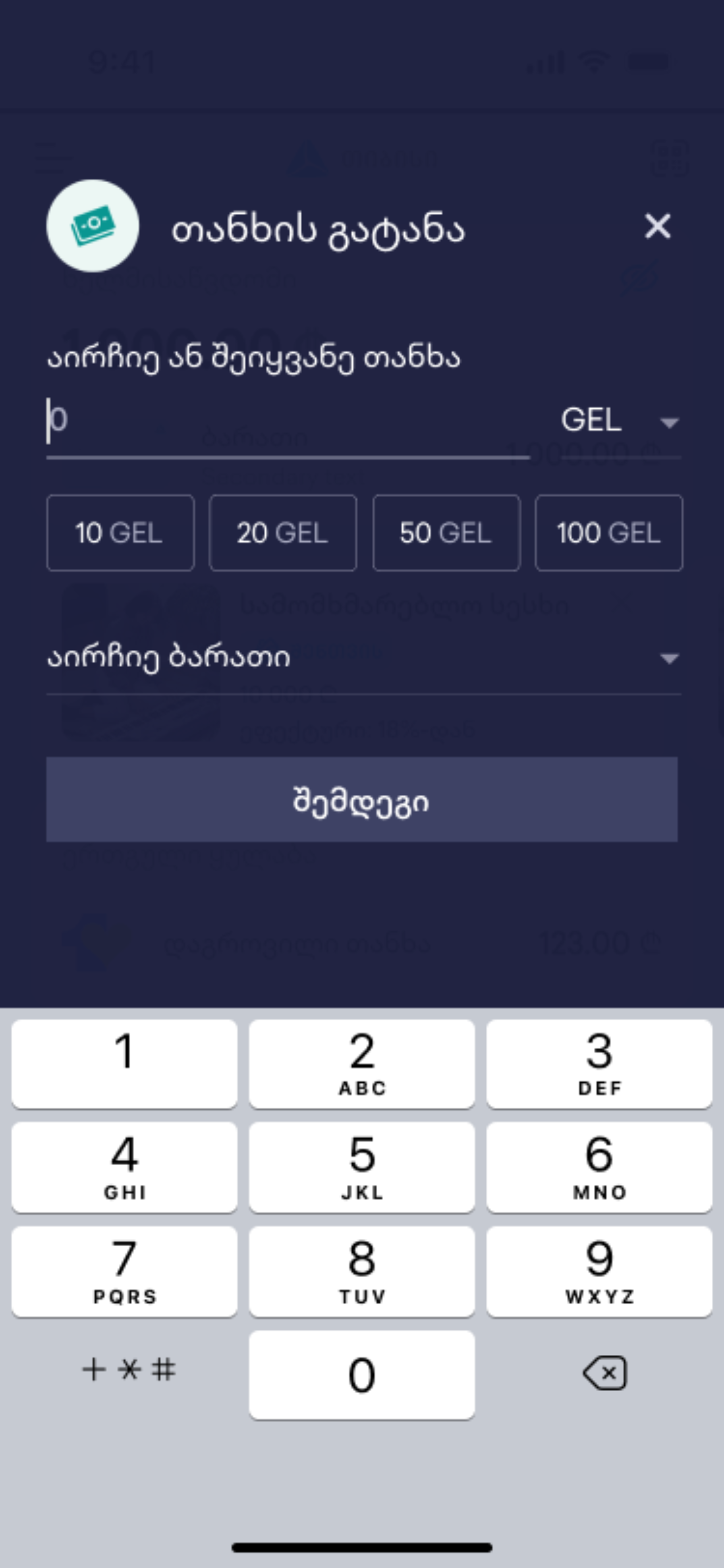
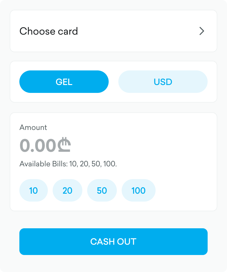
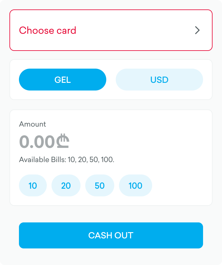
Amount
65.00
$
Available Bills: 10, 20, 50, 100.
10
20
50
100
Amount not available

We can’t make exactly $65 with our current bills
Choose Alternative
$ 60
$ 70

1

3


Thank You.
For walking through this experience. This project is about identifying where physical experiences break down and fixing them with the right digital tools.

Back to Home