Back
Case studies should be viewed in bigger screens for now
Back
Case studies should be viewed in bigger screens for now
Back
Case studies should be viewed in bigger screens for now
Back
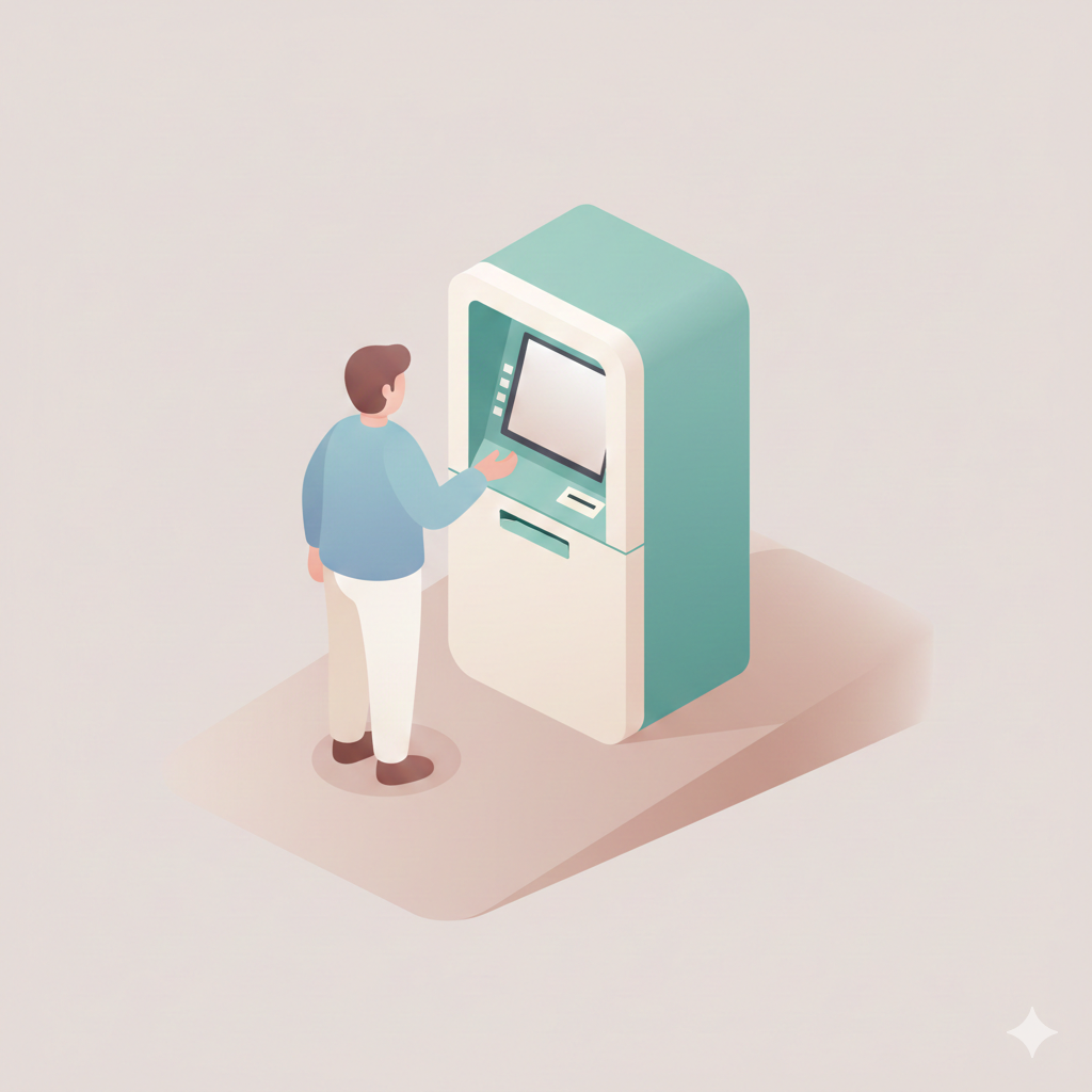
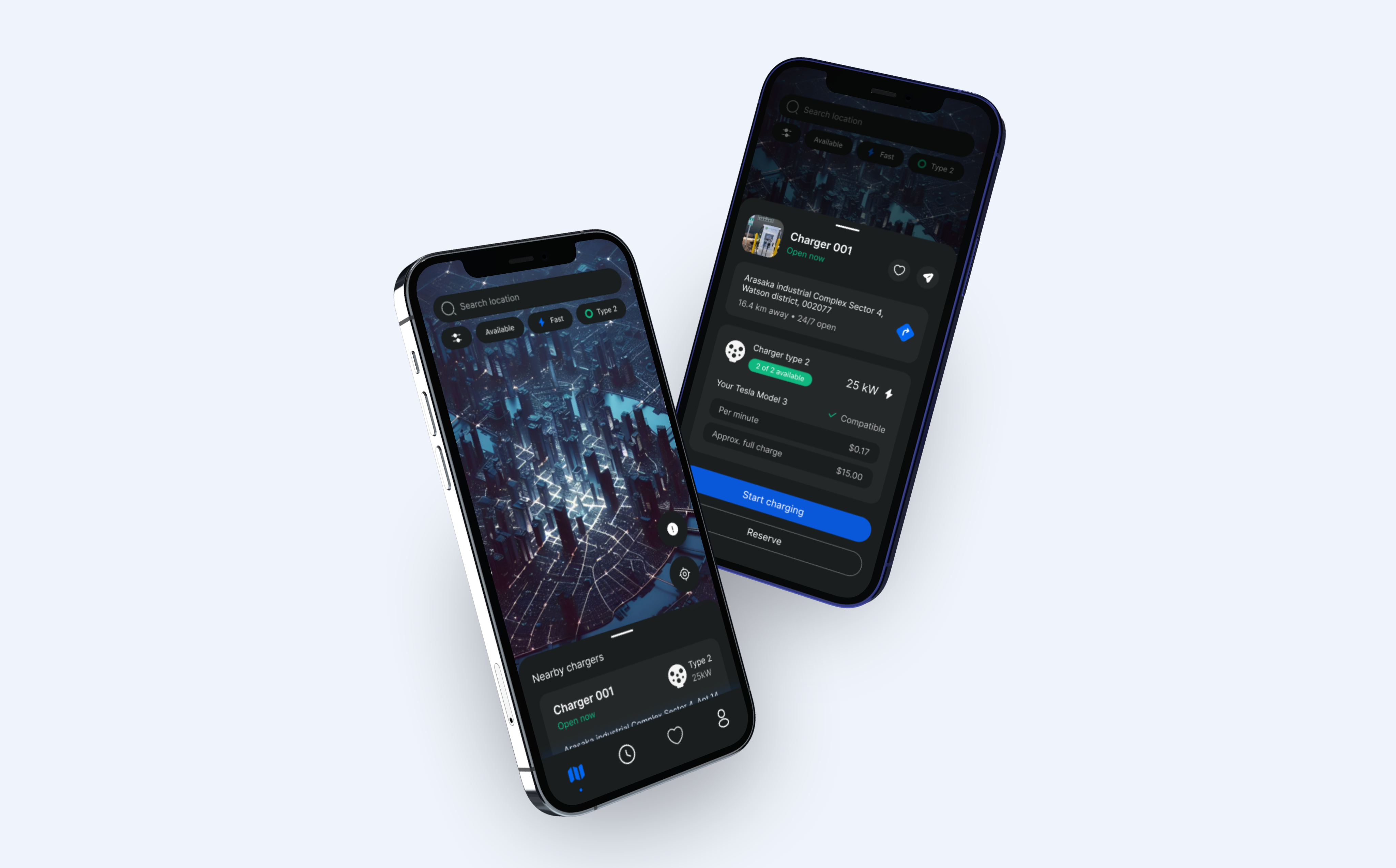
ESpace: Rethinking EV Charging Experience
UX audit of Georgia's leading EV charging app, identifying critical pain points and proposing data-driven solutions to improve user experience and reduce friction.
App name
ESpace
My role
Product designer
Platform
iOS / Android
ESpace is Georgia's primary EV charging application, helping users locate charging stations and manage payments. Despite its utility, user research revealed significant friction points affecting the core charging journey. My goal was to conduct a thorough UX audit, identify critical issues, and propose design improvements grounded in user needs.
To understand EV drivers deeply, I researched owner forums, conducted qualitative interviews with Georgian EV drivers, and created detailed empathy scenarios mapping how users think, feel, and act throughout their charging journeys.
About charger

What type of charger is it?
What type of charger does my car take?
About location

How far is it from me?
How much time do I need to get there?
About availability
Is charging station free of car & available?
Can I reserve it so if I go there, no one would take over?
About time & cost
How much does it cost?
How much time does it take my car to charge?
Will it charge me if I don’t un-plug my car on-time?
Can I see the progress of my charging?
Do I receive notifications if there is any issue?
Four key scenarios emerged from research, each revealing unique user needs and contexts.

1
Home planning
User at home needs charging and opens app to find nearest available spot
3
On-the-Go Emergency
User in car with low battery urgently needs nearest charger.
2
Activity-Based Charging
User going to gym wants to charge car nearby while working out
4
Trip Planning
User planning long trip, Needs route charging spots
Visualizing the complete charging journey revealed critical interaction points, alternative paths, and opportunities for improvement across three main phases.

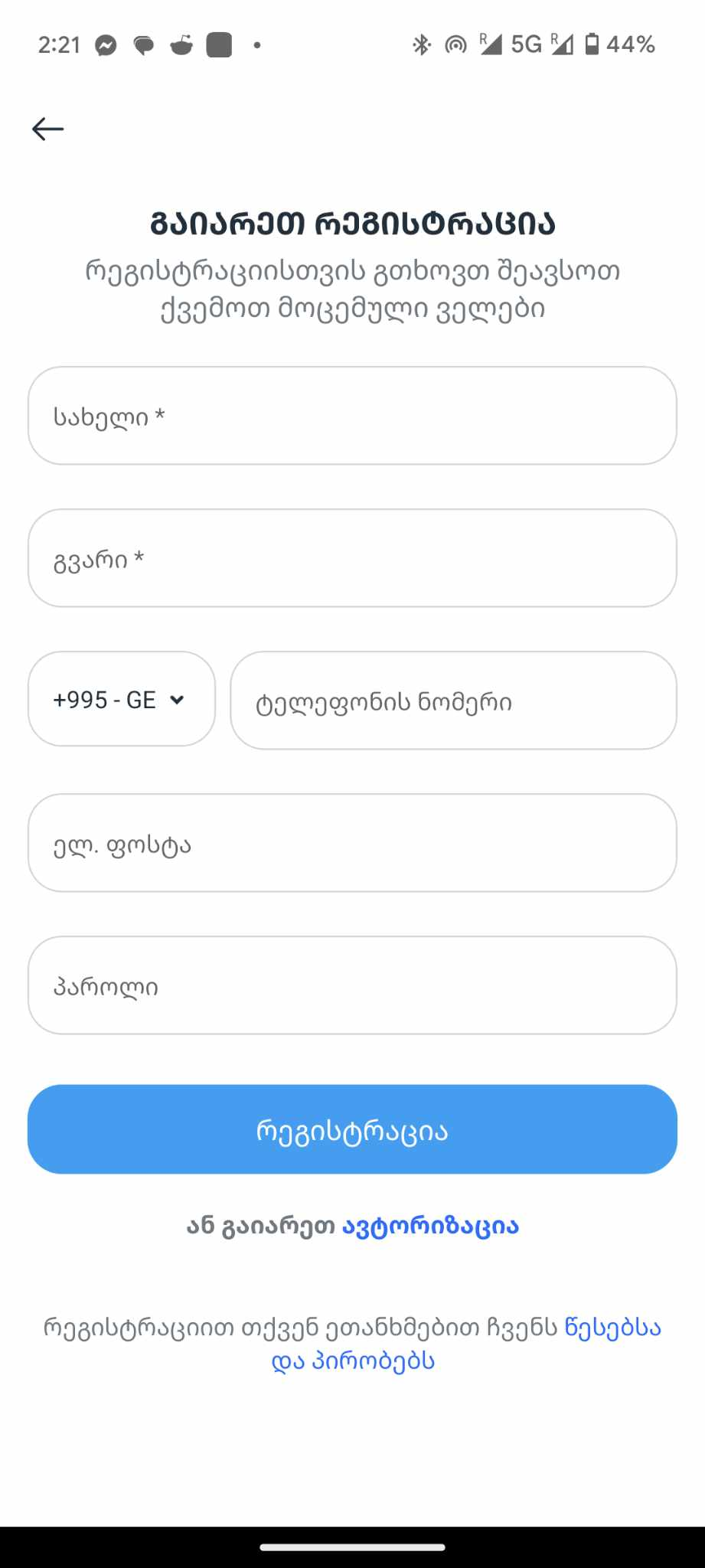
Downloads & Registration
First impression
Important to have permissions from a device (GPS & Notifications)
One-Time Process

First impression

Reviews On-Boarding screens
Or skips it
Registers
Makes OTP authorization
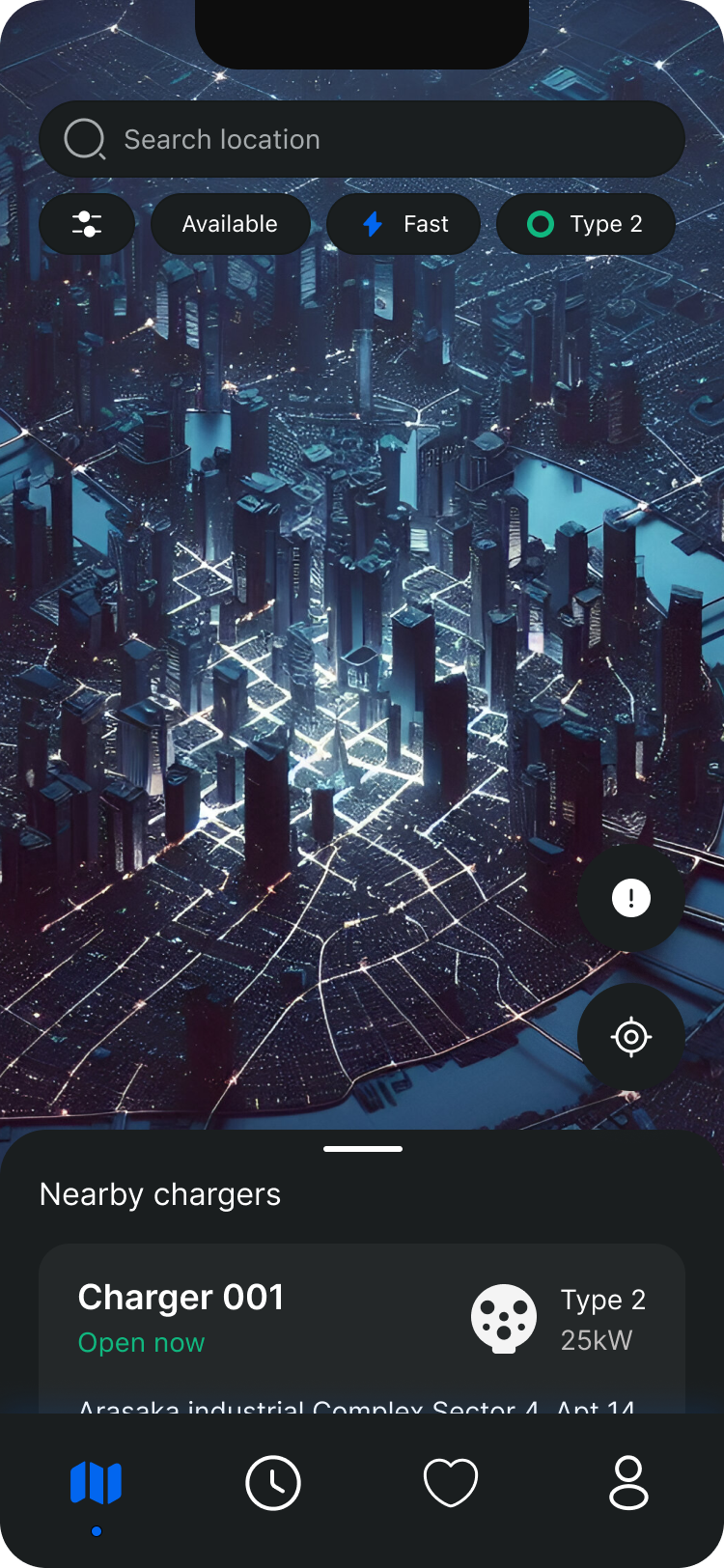
Search & Book
Main activity in app
Repeating routine process
Life scenarios to consider
Important to be easy & fast
Important to send status notifications
Easy payment
Tries to find charger
Goes & Tries to find location
Makes payments
Starts charging
Charging ends

1/6

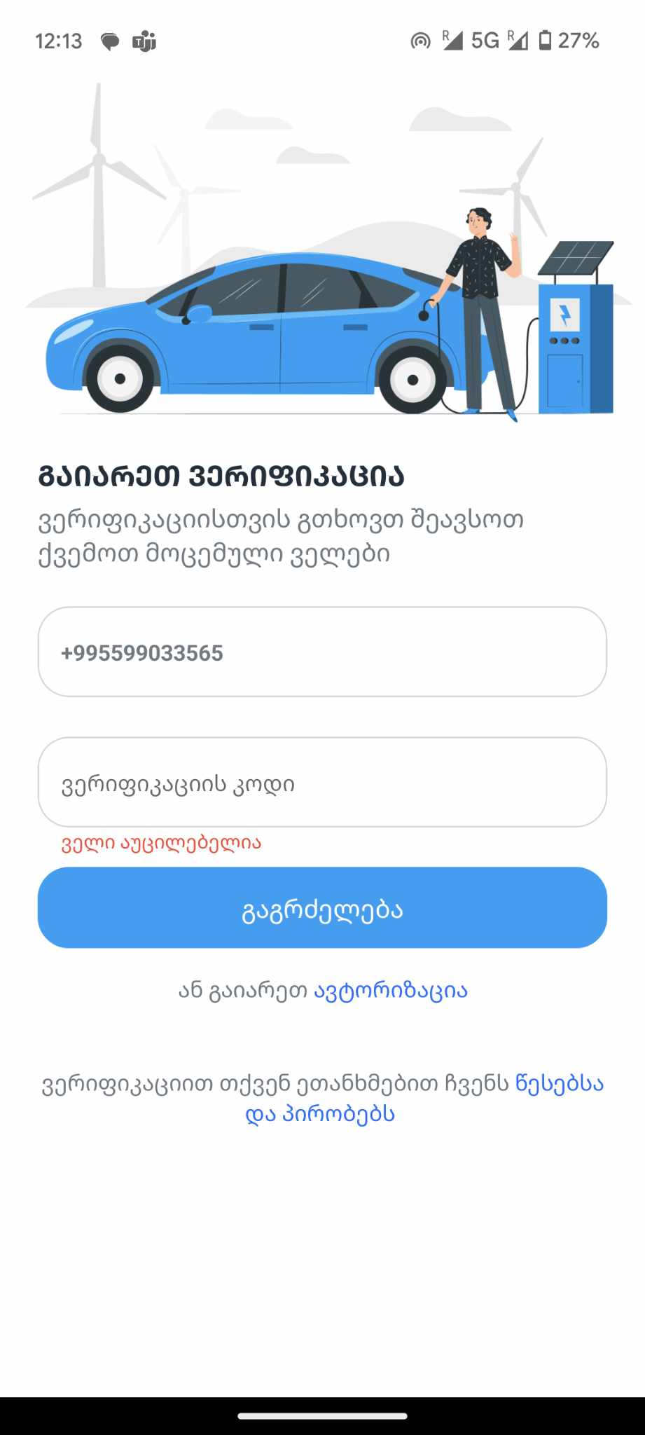
One time password verification
Onboarding
No possibility to resend the code
If user is met with some type of error once submitting the code,
will have a hard time figuring out how to get the new code.
Copy don’t corresponds the action
Instead of stating that multiple forms need to be filled out, the focus should be on guiding the user through one clear task: receiving and entering the 4-digit code.
{Translation - For verification, please fill necessary fields}

Things I would improve
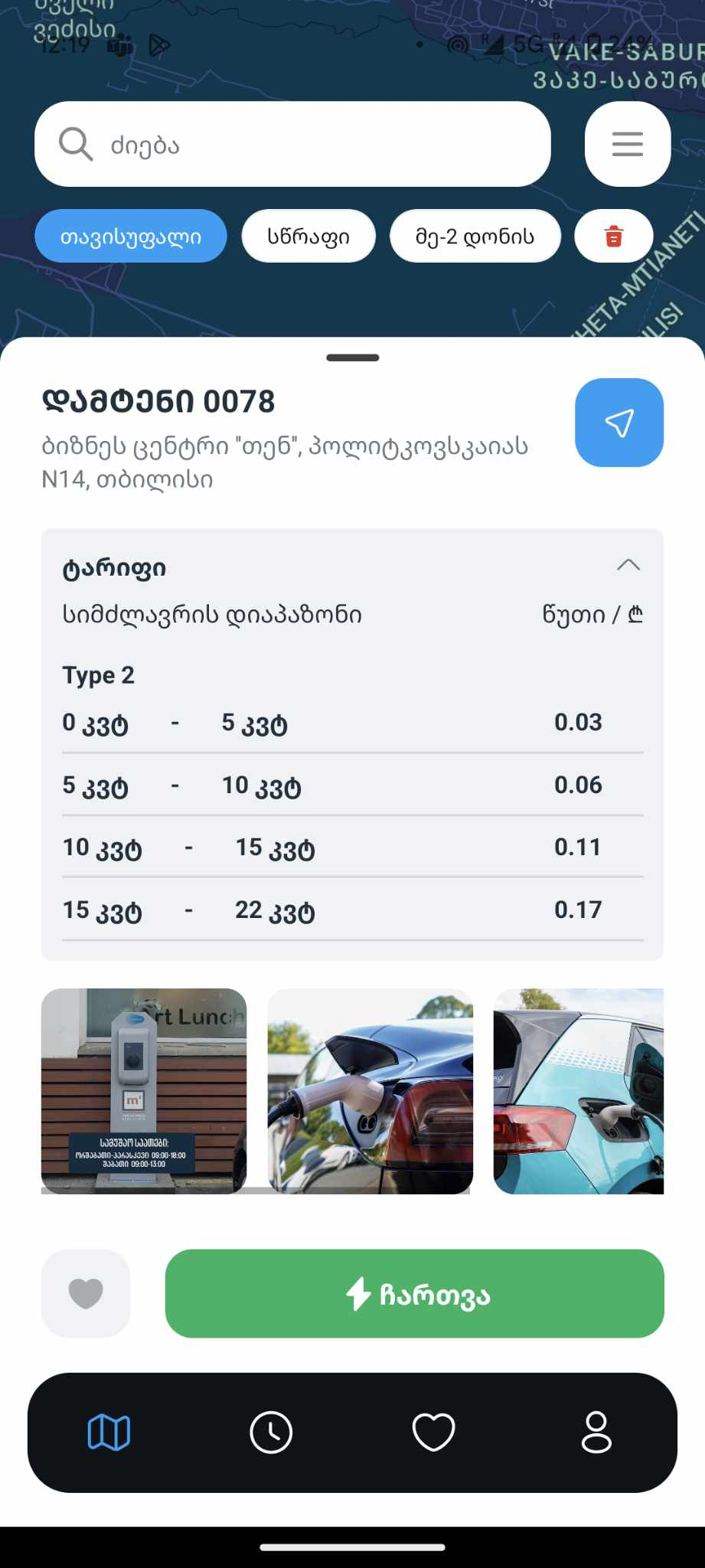
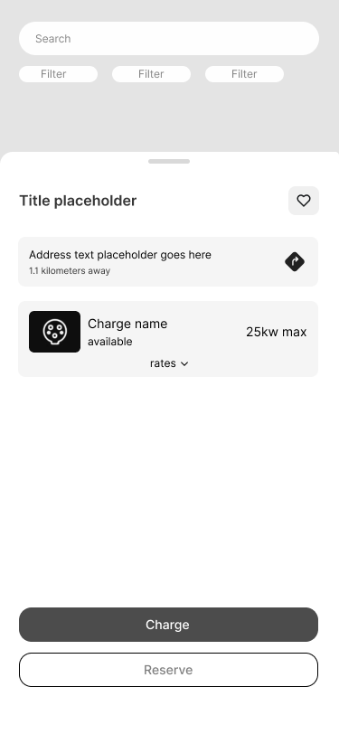
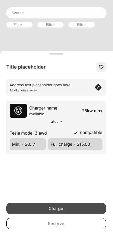
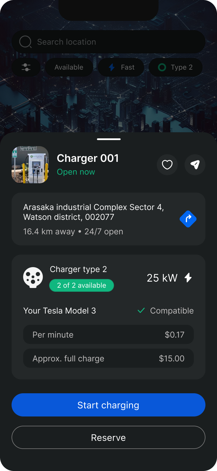
As mentioned in the design review, this screen is missing several key details drivers need during their journey.
There is no clear indication of the charger type, making it difficult to assess compatibility at a glance. Pricing information is also unclear, as users are not informed which pricing category applies to them.
Pricing transparency and compatibility details are essential for a seamless charging experience.
Clear pricing helps users make informed decisions and avoid unexpected costs, while compatibility information allows drivers to quickly confirm whether a station supports their specific EV—reducing friction and wasted time.
#1 UX Challenge
User needs
to know the Rates and
Compatibility

Feature structure

For a solution, we have to rethink the journeyand go way back to onboarding stage.
In order to give user a precise rate, one way
is to know their Car model & How much Kw intake it has.
For the first step
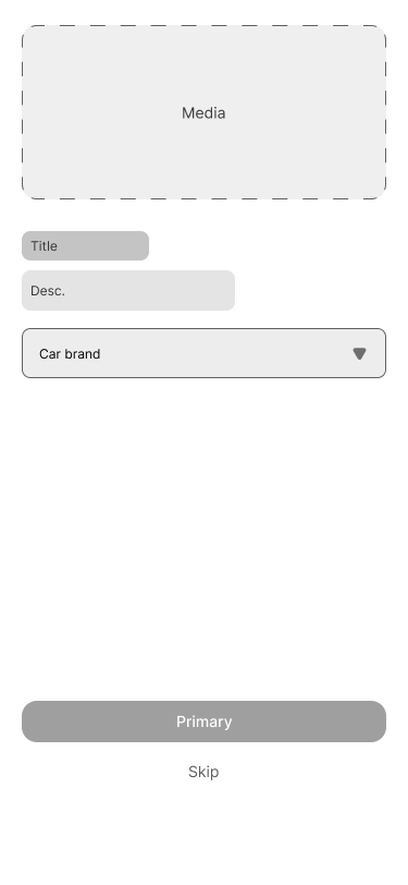
I think it should be in one of the registration journey as an optional feature to not actually overwhelm a user.
Step 1
Step 2
Step 3
New optional feature
Registration
OTP
Add car

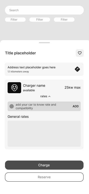
2nd place to involve ‘car adding’ feature
It is chargers page itself.This applies to users who skipped it during the registration process and later realized they need it at this stage.
On this screen
Users EV is already added and we have possibility to highlight that compatibility is checked. In addition we can show accurate info about charger rate user should expect for their car.
It also benefits filters
As we know specific mark and model, we know what kind of charging type it needs. We can filter out not compatible chargers for the user.


Imagine
Driving to a chosen charging station with a low battery, only to find it occupied, leaves users with a depleted battery and the stress of finding another station.
This highlights a usability issue: users need real-time availability information. A reservation feature could help users plan better and avoid getting stranded.
#2 UX Challenge
User needs
to have Guaranteed Availability
There are couple of variations of reservation right?
for example, take MS Teams or Slack’s meeting creation.

But we need something even easier here
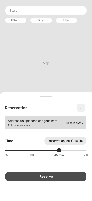
My solution is a bit simpler, where user:
Tries to find charger

Books the charger
There’s one button
Inner page consisting of destination time from the user
and slider component with pre-defined pricing/timing options.
Pays the booking fee
Charging until Full charge
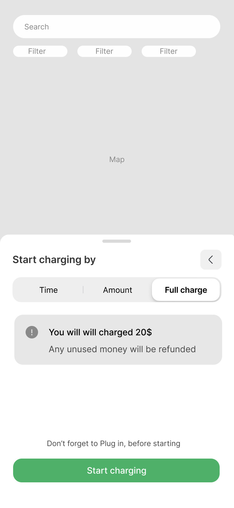
#3
Improving 2 charging options and adding one more option!
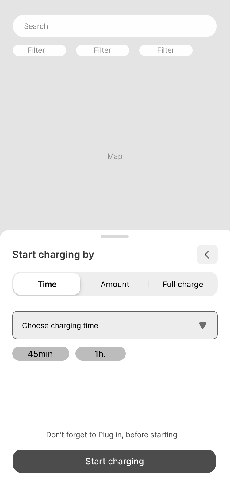
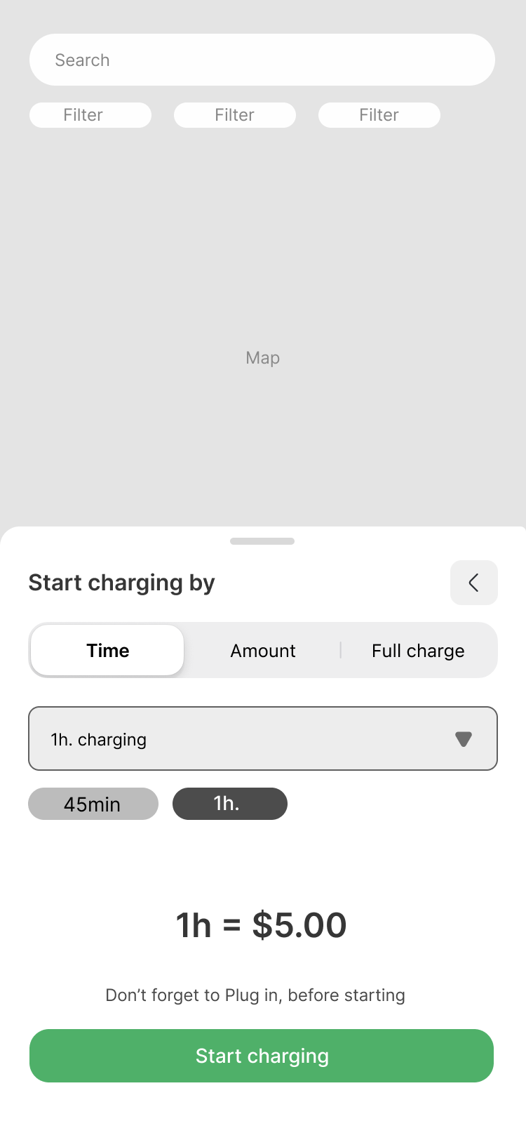
Charging with time
I introduced this feature to support common real-life scenarios, such as charging during a café break, at work, or while at the gym.
The page uses a native dropdown component, adapting automatically to Android and iOS patterns to ensure a familiar and intuitive experience. The dropdown offers predefined time options (e.g. 30 min, 1 hr, 1 hr 30 min).
To further reduce friction, quick shortcut buttons are included to speed up selection. These shortcuts can adapt over time based on user behavior, surfacing the most frequently chosen durations.
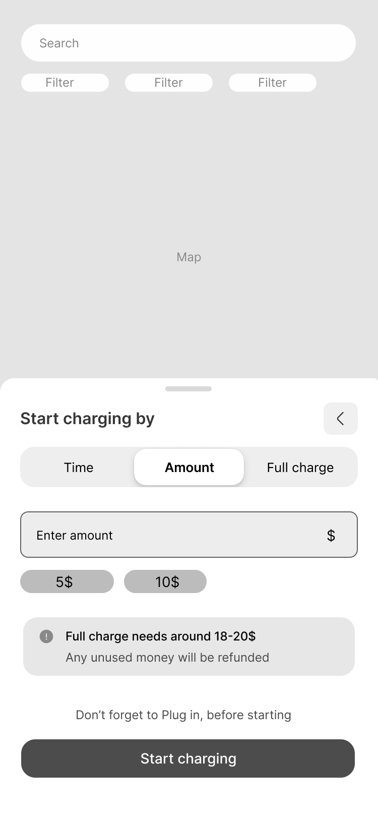
Charging with desired Amount
Same same, but different. (Solution for sure)


Thank You.
For exploring ESpace. This journey is about more than just charging stations. it's about meeting drivers where they are, and designing clarity into every moment of uncertainty.

Back to Home